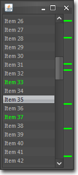
 In what may turn out to be a regular feature, I wanted to start talking about some of the work I do involving the creation of custom Java Swing components. As anyone who has seen the GUIs I create will know, I quite often create custom components for a variety of purposes. It’s not difficult to write custom Swing components, but there are a few hints and tips which can make this easier and result in well performing components. Hopefully this series will be interesting to those readers who are using Java Swing and inspire them to create their own interesting custom components.
So… let’s get started!
For one of the Java Swing GUI projects I’m working on there’s a requirement to display a visual representation of the index of a list of items with particular items in this index highlighted according to certain criteria. Think along the lines of the margin shown in intelligent code editors used to highlight warnings and errors in the code (such as the right hand margin in IntelliJ IDEA), and you’re not too far from the mark.
This is quite a specialised component so obviously doesn’t exist in the standard Swing set, but it’s a nice little component to write so I thought I’d share with you how I created it. To show you exactly what this component will look like when finished there’s a screenshot of it in action on the right.
Getting started
This will be a fairly simple component in terms of graphical content and behaviour, and there are no existing Swing components which are similar to it, so we will derive our new component from the base Swing component class, JComponent.
public class ListIndexBar extends JComponent {

}
Breaking the design down into the key aspects, we need to consider:
- keeping track of how many items there are in the list this component represents
- keeping track of the indices of all items which need to be highlighted
- calculating the vertical pixel position and height of each item marker based on the current height and the total number of items in the associated list
- painting the item markers
- handling mouse events to change the cursor when hovering over item markers and to handle mouse clicks on item markers
So let’s start with the first couple of items.
private int itemCount;

// set of list indices associated with items to be marked
private Set<Integer> markerSet = new HashSet<Integer>();

public int getItemCount() {
  return itemCount;
}
public void setItemCount(int itemCount) {
  this.itemCount = itemCount;
  recalc();  // more on this later
  repaint();  // we've made changes which affect appearance so trigger a repaint
}

public Set<Integer> getMarkerSet() {
  return markerSet;
}

public void addMarkers(Collection<Integer> markers) {
  markerSet.addAll(markers);
  repaint();
}

public void removeMarkers(Collection<Integer> markers) {
  markerSet.removeAll(markers);
  repaint();
}

public void clearMarkers() {
  markerSet.clear();
  repaint();
}
Calculating item marker sizes
Now let’s do the simple calculations associated with working out where each item marker needs to be painted.
We know the height of the component and the total number of items in the associated list so we can calculate the vertical size each item marker needs to be. From this we can work out the vertical pixel position that each item marker needs to be painted at. Note, this calculation needs to be done whenever there is a change in the component size or when the total number of associated list items changes. Accordingly, we call recalc() in the setItemCount method and we also override the two setBounds methods to call recalc() after calling their superclass method.
private double scaleFactor;
private int markerHeight;

private void recalc() {
  scaleFactor = getHeight() / (double) itemCount;
  markerHeight = Math.max(2, (int) scaleFactor);  // markers have min height of 2
}

@Override
public void setBounds(Dimension dimension) {
  super.setBounds(dimension);
  recalc();
}

@Override
public void setBounds(int x, int y, int width, int height) {
  super.setBounds(x, y, width, height);
  recalc();
}
Painting
So now we get to the guts of the component – the painting code. Hopefully this should be self explanatory – there’s nothing too complex going on here.
@Override
protected void paintComponent(Graphics g) {
  // cast to a Graphics2D so we can do more with it
  Graphics2D g2 = (Graphics2D) g;

  // paint or clear the background depending on whether this component is opaque
  // or not. store the current composite so we can restore it later
  Composite composite = g2.getComposite();
  g2.setColor(getBackground());
  if (!isOpaque()) {
    // if not opaque, set the alpha composite to clear the background
    g2.setComposite(AlphaComposite.getInstance(AlphaComposite.DST));
  }
  g2.fillRect(0, 0, getWidth(), getHeight());
  g2.setComposite(composite);  // restore the previous composite

  // markers will be drawn with the foreground colour
  g2.setColor(getForeground());

  int pos;
  for (Integer marker : markerSet) {
    // for each marker, calculate the appropriate Y position
    // and paint a marker of required size
    pos = (int) (marker * scaleFactor);
    g2.fillRect(0, pos, getWidth(), markerHeight);
  }
}
Handling mouse events and finishing off
We’re nearly finished now – the only thing left is to add the code to handle mouse events and initialise the object in its constructor.
We need to handle three types of mouse event:
- motion events so that we can change the cursor when hovering over an item marker to give a visual cue to the user that the item can be clicked on
- mouse exit events so we can clear the highlighted index and reset the cursor when the pointer leaves the component
- mouse click events when hovering over item markers
We also need to keep track of the index of the last highlighted index so it can be included in the selection notification event. If there is no currently highlighted index we set this to -1. We are re-using the existing Swing ListSelectionListener and associated ListSelectionEvent classes here for our notifications for convenience as they are a close match to what we need. We could quite easily enough have used our own custom listener and event classes which are more tailored to this particular situation – but it doesn’t make much difference.
And finally, we do the last bit of initialisation in the constructor, including setting the initial number of items and setting an initial minimum and preferred size so that the component appears with a sensible size when first created. Oh, and we provide an alternative no-arg constructor which uses a default item count of 1!
// the index of the currently highlighted marker index
// gets set when the pointer hovers over a marker and cleared when the mouse is moved off a marker
// or the pointer leaves the component completely
private int highlightedIndex = -1;

// keep track of listeners interested in marker selection events
private List<ListSelectionListener> listeners = new ArrayList<ListSelectionListener>();

public ListIndexBar(int itemCount) {
  this.itemCount = itemCount;
  recalc();

  // add a mouse motion listener to track the current highlighted marker
  addMouseMotionListener(new MouseMotionAdapter() {
    @Override
    public void mouseMoved(MouseEvent e) {
      // calculate the list index which is under the mouse pointer
      int pos = (int) (ListIndexBar.this.itemCount * (e.getPoint().getY() / getHeight()));
      if (markerSet.contains(pos)) {
        // we're over one of the markers so record the index and change the cursor
        highlightedIndex = pos;
        setCursor(Cursor.getPredefinedCursor(Cursor.HAND_CURSOR));
      } else {
        // we're not over any marker so clear the highlighted index
        // and reset the cursor
        highlightedIndex = -1;
        setCursor(Cursor.getPredefinedCursor(Cursor.DEFAULT_CURSOR));
      }
    }
  });

  // add a mouse listener to handle mouse clicks on markers
  addMouseListener(new MouseAdapter() {
    @Override
    public void mousePressed(MouseEvent e) {
      if (highlightedIndex != -1) {
        ListSelectionEvent event = new ListSelectionEvent(ListIndexBar.this, highlightedIndex, highlightedIndex, false);
        for (ListSelectionListener listener : listeners) {
          listener.valueChanged(event);
        }
      }
    }

    @Override
    public void mouseExited(MouseEvent e) {
      // clear the highlighted index when we leave this component
      highlightedIndex = -1;
      setCursor(Cursor.getPredefinedCursor(Cursor.DEFAULT_CURSOR));
    }
  });

  // give the component a min and preferred size
  setMinimumSize(new Dimension(16, 60));
  setPreferredSize(new Dimension(16, 60));
}

public ListIndexBar() {
  this(1);
}

public void addSelectionListener(ListSelectionListener listener) {
  listeners.add(listener);
}

public void removeSelectionListener(ListSelectionListener listener) {
  listeners.remove(listener);
}
And that’s it!
Wrapping up
This is not a particularly complex custom component so hopefully the code has been easily understandable and I hope it’s given you an insight into how you can create effective custom components without having to write too much code.
I’ve attached a complete copy of the component code together with an example class making use of the component below.
ListIndexBar component code and example

